
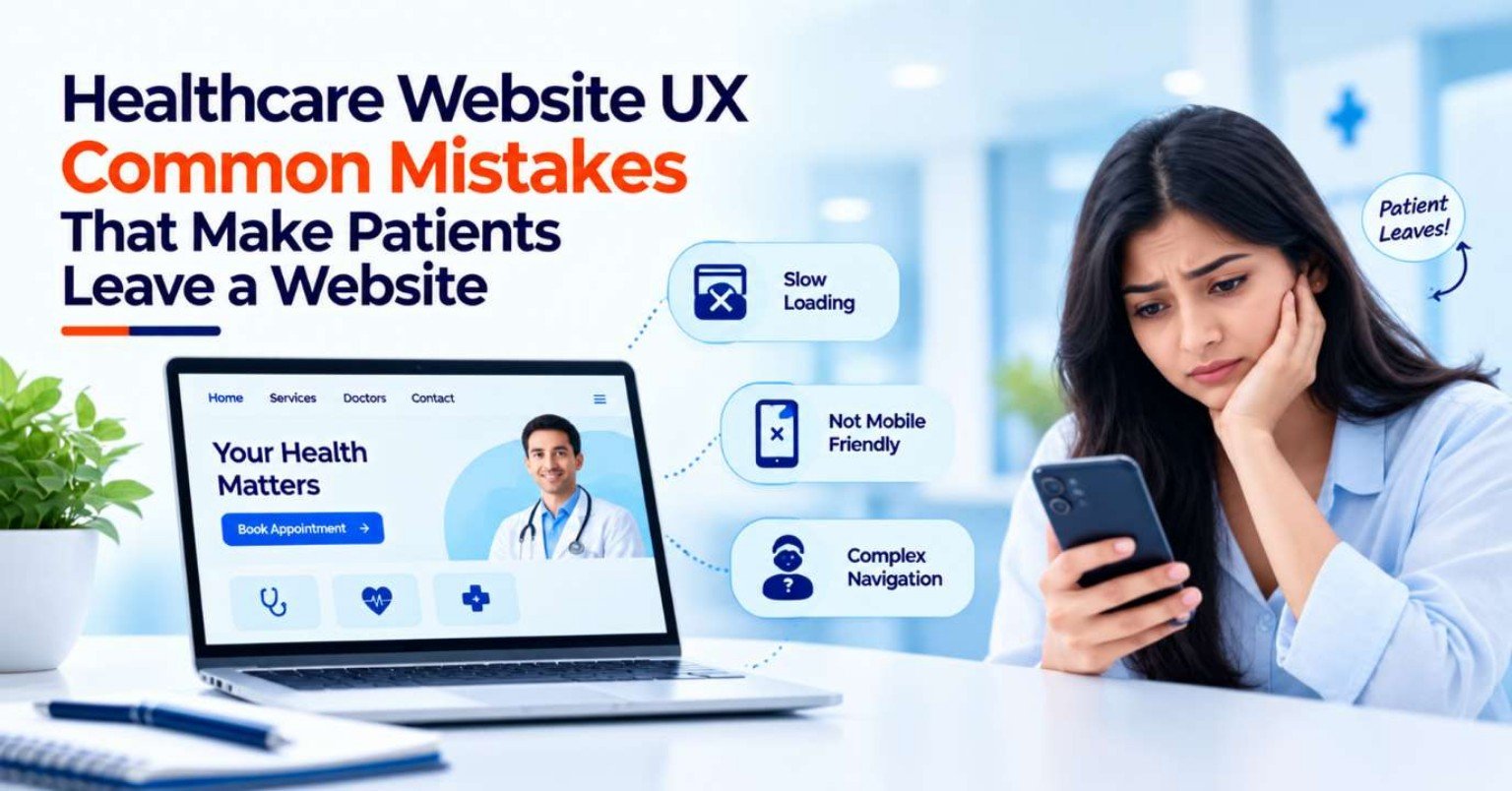
A healthcare website may have excellent doctors, advanced facilities, and a wide range of services, but that information does not help much if visitors cannot find what they need.
Patients often visit a healthcare website with a specific purpose. They may want to find a doctor, understand a service, check consultation timings, locate a hospital, call the clinic, or request an appointment. If the website makes these tasks difficult, visitors may leave before contacting the healthcare provider.
This is where healthcare website UX becomes important.
UX, or user experience, refers to how easily and comfortably people can use a website to accomplish what they came to do. For healthcare websites, good UX is particularly important because visitors may already be dealing with uncertainty and may need clear, trustworthy information without unnecessary friction.
In 2026, healthcare businesses need websites that are not only visually attractive but also easy to navigate, accessible, mobile-friendly, fast, and focused on real patient needs.
What Is Healthcare Website UX?
Healthcare website UX is the overall experience a visitor has while interacting with a medical website.
It covers elements such as:
- Website navigation
- Page structure
- Content readability
- Mobile experience
- Appointment forms
- Calls to action
- Search functionality
- Doctor profiles
- Service pages
- Accessibility
- Website speed
- Error handling
- Contact options
- Trust and information clarity
A website can look modern and still provide poor UX.
For example, a beautiful homepage is not enough if a visitor has to click through five pages to find a phone number or cannot understand how to book an appointment.
The best way to evaluate healthcare UX is to ask:
“Can a patient complete their intended task easily?”
Why Poor UX Can Make Healthcare Visitors Leave
Website visitors generally have limited patience for confusing interfaces.
A patient who cannot find a relevant doctor, understand a service, use an appointment form, or locate contact information may simply return to Google and choose another website.
This does not necessarily mean that the healthcare provider itself is unsuitable. The website may simply have created too much friction.
For healthcare businesses, common UX problems can therefore affect:
- Patient engagement
- Appointment enquiries
- Phone calls
- Online bookings
- Trust
- Search experience
- Brand perception
- Website conversions
UX should therefore be considered part of the overall healthcare website strategy rather than just a visual design exercise.
1. Complicated Navigation
One of the most common healthcare website UX mistakes is making navigation unnecessarily complicated.
A large hospital website may have dozens of departments, doctors, services, facilities, locations, and resources. If all of these are placed into an overwhelming menu, visitors may struggle to find the right path.
A better structure groups information logically.
For example:
Services → Cardiology → Cardiology Services
or:
Doctors → Cardiology → Doctor Profile
Navigation labels should also be understandable to ordinary visitors rather than relying heavily on internal hospital terminology.
W3C recommends consistent navigation across pages so users can predict where repeated navigation elements will appear and find information more easily.
2. Hiding Important Contact Information
A healthcare website should not make visitors hunt for a phone number.
If someone wants to ask a quick question or book an appointment by phone, the contact option should be easy to find.
Important information can include:
- Phone number
- Appointment number
- Address
- Opening hours
- Emergency information where relevant
- Email where appropriate
- Location directions
These details can appear in the header, footer, contact page, and relevant service or location pages.
The exact placement depends on the website, but the principle remains simple:
Important contact information should be easy to discover.
3. Making the Appointment Process Too Long
A patient may decide to book an appointment but abandon the process if the form feels excessive.
For example, asking for:
- Full address
- Multiple unnecessary personal details
- Extensive medical information
- Repeated contact information
- Irrelevant questions
may create unnecessary friction.
W3C’s updated Forms Tutorial recommends keeping forms simple and asking only for information required to complete the process because excessive or irrelevant data can increase abandonment.
Healthcare organisations should therefore review every form field and ask:
“Do we actually need this information at this stage?”
4. Using Unclear Form Labels
A form that says only:
Name
Details
Submit
may not provide enough context.
Users should understand what information each field expects.
For example:
- Full Name
- Mobile Number
- Email Address
- Select Department
- Preferred Appointment Date
- Your Enquiry
W3C guidance recommends providing labels or instructions so users understand what information is expected in each input.
Clear labels are useful for everyone, not only people using assistive technologies.
5. Showing Poor Error Messages
Imagine a patient fills out an appointment form and receives:
“Error 400.”
What should they do next?
A useful healthcare website should explain the problem clearly.
For example:
“Please enter a valid mobile number.”
or:
“Please select a preferred appointment date.”
Users should also be able to identify which field needs correction.
W3C guidance recommends identifying input errors and providing information that helps users understand and correct them.
A confusing error message can turn a simple enquiry into an abandoned enquiry.
6. No Confirmation After Form Submission
Another frustrating experience is submitting an appointment request and seeing nothing happen.
The visitor may wonder:
- Was my form submitted?
- Did the website receive my information?
- Should I submit it again?
- Will someone contact me?
A clear confirmation message can remove this uncertainty.
For example:
“Your appointment request has been received. Our team will contact you during the stated working hours.”
The message should reflect the organisation’s actual process.
If a booking is not confirmed immediately, the website should not falsely suggest that an appointment has been booked.
7. Too Many Pop-Ups
Pop-ups can be useful in certain situations, but excessive pop-ups can interrupt the patient journey.
Examples include:
- Newsletter pop-ups
- Discount messages
- Appointment pop-ups
- Chat windows
- Cookie notices
- Promotional banners
- Exit-intent messages
When several appear at once, the main content can become difficult to access.
This is particularly problematic on mobile devices, where screen space is limited.
A healthcare website should prioritise the information the visitor came to access instead of constantly interrupting it.
8. Autoplay Videos and Distracting Animations
A homepage with large animations and video backgrounds may look impressive, but visual effects should not interfere with usability.
Problems can arise when:
- Videos autoplay with sound
- Animations distract from important content
- Moving elements make text difficult to read
- Important CTAs are hidden among animations
- Pages become slower because of heavy media
Healthcare websites should use visual elements to support communication rather than compete with it.
The design should remain comfortable for visitors who simply want information.
9. Poor Mobile UX
A website may look perfect on a desktop computer and still be difficult to use on a smartphone.
Common mobile UX problems include:
- Tiny text
- Small buttons
- Difficult menus
- Horizontal scrolling
- Forms that do not fit the screen
- Phone numbers that are not clickable
- Overlapping elements
- Pop-ups covering the page
- Slow-loading images
W3C notes that navigation and orientation can present additional challenges on small screens and different devices.
Healthcare websites should therefore be tested on real mobile devices rather than relying only on a desktop browser preview.
10. Making Visitors Search Too Hard for Doctors
Patients frequently want to know which doctor provides a particular service.
If the website has hundreds of doctor profiles but no useful filtering or search structure, finding the right person can become frustrating.
Useful organisation can include:
- Speciality
- Department
- Location
- Doctor name
- Consultation type
- Availability where appropriate
Doctor profiles should also provide a clear route to the next action.
A visitor should not have to return to the homepage after reading a doctor profile just to find an appointment option.
11. Generic Service Pages
A page titled “Our Services” with twenty service names and almost no information may not provide a useful patient experience.
Visitors usually need more context.
A dedicated service page can explain:
- What the service is
- Which department provides it
- Which doctors are associated with it
- Relevant locations
- Common questions
- How to contact the provider
The page should answer the visitor’s likely questions rather than simply listing a service name.
12. Using Too Much Medical Jargon
Healthcare websites often contain specialist terminology because medical professionals naturally use it.
Patients may not.
If a page contains unexplained technical terms, abbreviations, or complex descriptions, visitors may struggle to understand the information.
This can be improved by:
- Using plain language
- Explaining technical terms
- Breaking long information into sections
- Using descriptive headings
- Adding FAQs
- Avoiding unnecessary abbreviations
The goal is not to remove accurate medical terminology completely. It is to make important information understandable.
13. Long Walls of Text
A healthcare website can contain useful information and still be difficult to read.
Large blocks of text make it harder for visitors to scan a page and locate specific answers.
Instead, use:
- Short paragraphs
- Descriptive headings
- Bullet points
- Important information near relevant CTAs
- FAQ sections
- Clear spacing
- Visual hierarchy
This is particularly useful for visitors accessing the website on mobile devices.
14. Inconsistent Navigation Across Pages
Imagine the appointment button appears in the top-right corner on one page, in the middle of the navigation on another, and only in the footer on a third page.
This forces visitors to relearn the interface.
Consistent navigation makes a website more predictable.
W3C specifically recommends keeping repeated navigation mechanisms in a consistent relative order across pages.
Consistency is especially important on large healthcare websites with many sections.
15. Weak Search Functionality
Large healthcare websites can contain hundreds or thousands of pages.
If visitors cannot find information through website search, they may struggle to locate:
- Doctors
- Departments
- Services
- Locations
- Patient resources
- FAQs
- Articles
A useful internal search function can be particularly valuable for larger organisations.
Search results should also provide understandable titles and relevant descriptions rather than technical page names.
16. Making Important Information Look Like Ordinary Text
If Book an Appointment is the primary action, it should look interactive.
If a phone number is clickable, it should be visually identifiable.
If Find a Doctor is a button, users should recognise it as a button.
W3C’s navigation guidance highlights the importance of predictable labels and controls so users can understand what an interaction will do.
Visual hierarchy should help visitors understand:
What is information?
What is clickable?
What happens next?
17. Ignoring Accessibility
Accessibility should not be treated as a separate technical checklist after the design is finished.
Common issues include:
- Missing form labels
- Poor colour contrast
- Images without useful alternative text
- Keyboard navigation problems
- Unclear focus states
- Inaccessible menus
- Confusing error messages
- Poor heading structure
W3C notes that accessible forms are generally easier to use for everyone and recommends clear labels, instructions, grouping, and understandable structure.
For healthcare organisations serving diverse populations, accessibility should be considered during design and development from the beginning.
18. Slow-Loading Pages
Patients may leave a website simply because it takes too long to become usable.
Large images, unnecessary scripts, excessive animations, third-party tools, and poorly optimised code can all contribute to performance problems.
Healthcare businesses should monitor important templates such as:
- Homepage
- Service pages
- Doctor profiles
- Appointment pages
- Location pages
- Landing pages
Performance should be considered part of UX, not only a technical SEO issue.
19. Not Showing What Happens Next
A website may provide excellent information but fail to guide the visitor after they finish reading.
For example, after a visitor reads about a healthcare service, what should they do?
The page could provide relevant options such as:
Find a Doctor
Book an Appointment
Call the Department
View Location
The appropriate CTA depends on the page and visitor intent.
The important thing is to avoid leaving users at a dead end.
20. Forcing Every Visitor Into the Same Conversion Path
Not every visitor is ready to book an appointment immediately.
One person may want to call.
Another may want to read about a service.
Someone else may be looking for a specific doctor.
Another visitor may only need the hospital’s address.
A patient-friendly website should support different levels of intent rather than pushing every visitor toward the same form.
Useful options can include:
- Learn More
- Find a Doctor
- View Services
- Call Now
- Get Directions
- Book an Appointment
- Submit an Enquiry
This creates a more natural patient journey.
21. Missing Trust Information
Visitors may hesitate to contact a healthcare provider if the website gives them very little information about the organisation.
Potential trust-building information can include:
- Doctor credentials
- Department information
- Facility details
- Locations
- Contact information
- Professional affiliations where appropriate
- Clear service descriptions
- Updated content
- Privacy information
The purpose is not to overload every page with badges and claims. It is to give visitors enough accurate information to understand who they are considering contacting.
22. Outdated Website Information
Few things damage a healthcare website experience faster than incorrect information.
Examples include:
- Doctor who no longer works there
- Old phone number
- Incorrect opening hours
- Outdated address
- Discontinued service
- Old appointment process
- Broken booking link
Patients depend on healthcare websites for practical information.
Website content should therefore be reviewed regularly rather than treated as something that only needs updating during a redesign.
23. Poor Location Experience
For local healthcare providers, finding the facility should be easy.
A visitor may need:
- Exact address
- Map
- Directions
- Parking information
- Branch details
- Opening hours
- Contact number
If a healthcare group has several locations, each location should clearly identify its available services.
A generic “Contact Us” page with multiple addresses but no clear organisation can create unnecessary confusion.
24. Overloading the Homepage
Trying to show everything on the homepage can make it harder to understand.
A healthcare website may try to include:
- Every department
- Every doctor
- Every service
- Every award
- Every facility
- Multiple videos
- Numerous testimonials
- Several banners
- Dozens of CTAs
The result can be visual clutter.
The homepage should prioritise the information most relevant to the organisation’s main audiences and provide clear paths to deeper pages.
25. Designing Without Real User Testing
A website can look excellent to the development team and still confuse actual visitors.
Before launch, test realistic scenarios.
For example:
“Find a dermatologist and request an appointment.”
“Find the nearest hospital branch.”
“Understand this service and locate the relevant doctor.”
“Find the clinic phone number on mobile.”
Observe where users hesitate, make mistakes, or ask questions.
User testing can reveal UX problems that analytics alone may not explain.
How World SEO Services Can Help Improve Healthcare Website UX
Improving healthcare UX requires looking at the website from both the patient’s and the business’s perspective.
World SEO Services can help healthcare businesses review website structure, content pathways, conversion points, mobile experience, and SEO foundations to identify areas that may create unnecessary friction.
The process can include:
- Healthcare website UX review
- Navigation analysis
- Service-page structure
- Doctor-page usability
- Mobile UX checks
- Appointment journey analysis
- Form and CTA review
- Content readability
- Local information review
- Technical SEO considerations
- Conversion tracking
- Accessibility-focused checks
- Ongoing website improvements
The exact recommendations should depend on the website, audience, services, and patient journey rather than applying the same template to every healthcare organisation.
A Simple Healthcare Website UX Audit
Healthcare businesses can use the following questions as a quick UX check:
Can a visitor find a doctor easily?
If not, improve doctor search, speciality navigation, filters, or internal linking.
Can a visitor understand the service?
If not, improve service-page content and structure.
Can a visitor contact the organisation quickly?
If not, make phone, form, booking, or messaging options easier to find.
Can a visitor complete the form without confusion?
If not, simplify fields, improve labels, and provide useful error messages.
Does the website work properly on mobile?
If not, review layout, buttons, menus, forms, and page performance.
Can visitors understand what happens after submitting an enquiry?
If not, improve confirmation and follow-up messaging.
Is the navigation consistent?
If not, standardise menus, labels, and repeated navigation elements.
Is the information current?
If not, establish a regular content review process.
Final Thoughts
Healthcare website UX is ultimately about reducing unnecessary effort.
Patients should not have to fight with complicated menus, search through endless pages, complete unnecessarily long forms, or guess what a button does before they can contact a healthcare provider.
Common mistakes such as poor mobile design, unclear navigation, excessive pop-ups, confusing forms, weak error messages, outdated information, slow pages, inaccessible elements, and missing CTAs can all create friction.
A patient-friendly healthcare website should make important information easy to find, actions easy to understand, and interactions predictable.
Good UX does not mean adding more features. In many cases, it means removing unnecessary obstacles.
With a patient-focused approach, World SEO Services can help healthcare businesses build and improve websites that are easier to use, easier to navigate, and better aligned with the needs of visitors.
FAQs
1. What are the most common UX mistakes on healthcare websites?
Common mistakes include complicated navigation, long forms, unclear CTAs, poor mobile usability, slow pages, excessive pop-ups, confusing error messages, outdated information, difficult doctor searches, and inaccessible website elements.
2. Why do patients leave healthcare websites?
Visitors may leave when they cannot quickly find relevant information, understand a service, locate a doctor, contact the provider, use an appointment form, or navigate the website comfortably. Technical issues such as slow loading can also contribute to a poor experience.
3. How can healthcare websites improve their forms?
Healthcare websites can simplify forms by requesting only necessary information, using clear labels, identifying required fields, providing useful instructions, validating inputs, and explaining errors clearly. W3C recommends keeping forms simple and avoiding unnecessary data collection.
4. Why is consistent navigation important for healthcare websites?
Consistent navigation helps visitors understand where important information and controls are located. W3C recommends keeping repeated navigation mechanisms in a consistent order across pages so users can navigate more predictably.
5. How often should a healthcare website’s UX be reviewed?
UX should be reviewed whenever major services, navigation, forms, technology, or website structure changes. Healthcare businesses can also conduct periodic UX audits and test important patient journeys to identify usability issues before they affect more visitors.