
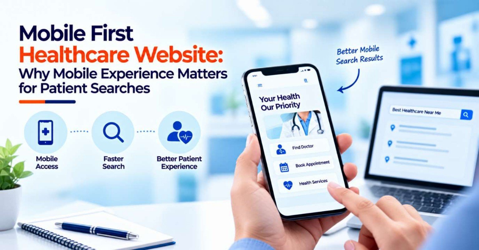
When people need healthcare information, they may not always sit at a desktop computer and search for a hospital, clinic, doctor, or medical service. A patient may search while travelling, during a lunch break, from home, or while trying to find a nearby healthcare provider.
This makes the mobile experience an important part of healthcare website development.
A healthcare website may contain excellent information, experienced doctors, and useful services, but if the mobile version is slow, difficult to navigate, difficult to read, or frustrating to use, visitors may leave before taking the next step.
That is why mobile-first healthcare website development focuses on designing the patient experience around smaller screens and touch-based interactions from the beginning.
Mobile-first does not simply mean making a desktop website responsive. It means considering the mobile user’s needs, limitations, search behaviour, navigation patterns, and conversion journey while planning the website.
In 2026, healthcare businesses need to think beyond whether a website “works on mobile.” They need to ask whether patients can search, understand, navigate, contact, and enquire easily on mobile devices.
What Is a Mobile-First Healthcare Website?
A mobile-first website is designed with smaller screens and mobile interactions as an important starting point.
Instead of creating a large desktop layout first and reducing it for a phone, developers consider questions such as:
- What information does a mobile visitor need first?
- Which actions should be immediately accessible?
- How can navigation remain simple?
- How easily can a patient call the provider?
- Can an appointment form be completed on a phone?
- Are service pages easy to scan?
- Does the website remain readable without unnecessary zooming?
- Does the page load efficiently?
Responsive design then allows the website to adapt to larger screens as well.
W3C’s current accessibility guidance recommends designing for different viewport sizes and ensuring that layouts adapt appropriately to smaller screens.
Why Mobile Experience Matters for Healthcare Searches
Healthcare searches can have strong practical intent.
Someone searching:
“dentist near me”
may want a nearby clinic.
Someone searching:
“cardiologist in [city]”
may be comparing providers.
Someone searching for a particular doctor may want qualifications, speciality, location, or appointment information.
A person searching for a hospital address may simply need directions and a phone number.
These users may not want to read a long homepage. They want to complete a specific task.
A mobile-first website should therefore make common patient tasks quick and understandable.
1. Make the Most Important Information Visible First
Mobile screens provide much less space than desktop screens.
This makes content hierarchy especially important.
The first screen should communicate the essentials rather than being filled with decorative elements.
Depending on the healthcare organisation, these may include:
- Healthcare provider name
- Primary service or speciality
- Location
- Primary CTA
- Phone number
- Appointment option
- Key trust information
The visitor should not need to scroll through a large hero image before finding out what the organisation actually does.
A clear hierarchy helps users understand the page quickly.
2. Make “Call Now” Easy to Use
For many healthcare businesses, phone calls remain an important enquiry channel.
A mobile visitor should not have to copy a phone number manually.
A clickable phone number or Call Now button can make the process easier.
It can be particularly useful on:
- Clinic pages
- Doctor profiles
- Service pages
- Location pages
- Contact pages
- Appointment pages
The button should be easy to tap without accidentally triggering another element.
The goal is simple: if a visitor wants to call, the website should not create unnecessary steps.
3. Make Appointment Booking Mobile-Friendly
An appointment form that works on desktop may still be difficult on a smartphone.
Common problems include:
- Tiny input fields
- Difficult dropdowns
- Excessive scrolling
- Too many required fields
- Poor date selectors
- Keyboard covering the form
- Unclear error messages
- Buttons that are difficult to tap
The form should be tested on actual mobile devices.
Only information that is genuinely required for the enquiry should be requested at that stage. This can reduce unnecessary friction and make the process easier to complete.
4. Use Touch-Friendly Interface Elements
Mobile users interact primarily through touch.
Buttons, menus, links, filters, and form controls therefore need enough space to use comfortably.
Problems can occur when:
- Buttons are too small
- Links are placed too close together
- Menu items are difficult to select
- Icons are unclear
- Important controls are positioned too close to screen edges
Mobile UX should account for different hand positions, screen sizes, and interaction methods.
W3C’s mobile accessibility work specifically considers touchscreen interaction, small screen sizes, and different input methods.
5. Keep Mobile Navigation Simple
A healthcare website may contain dozens of services and departments.
Trying to fit everything into a mobile navigation menu can make the experience overwhelming.
A simpler structure might be:
Services
Doctors
Locations
Appointments
About
Contact
From there, visitors can move into more specific sections.
Important navigation elements should remain consistent across the website so users do not have to relearn the interface on every page.
6. Prioritise Local Healthcare Searches
Many healthcare services are location-dependent.
Patients may search for:
- Hospital near me
- Clinic near me
- Dentist near me
- Diagnostic centre near me
- Doctor in a specific city
- Emergency hospital nearby
- Specialist near me
A mobile website should make local information easy to access.
Useful information includes:
- Full address
- Phone number
- Opening hours
- Location map
- Directions
- Branch information
- Available services
- Appointment options
For multi-location healthcare organisations, each important location should have accurate and clearly separated information.
7. Make Directions Easy to Access
A patient who finds a healthcare provider through mobile search may immediately need directions.
A location page can therefore provide a clear Get Directions action along with the address.
Additional information such as:
- Parking
- Building or floor information
- Nearby landmarks
- Entrance details
- Branch name
can be useful when relevant.
This is particularly important for hospitals and large healthcare facilities where simply providing a street address may not be enough.
8. Avoid Large Mobile Pop-Ups
Pop-ups can be difficult to use on a small screen.
A visitor may encounter:
- Appointment pop-ups
- Promotional banners
- Chat widgets
- Cookie messages
- Newsletter forms
- Exit-intent overlays
When these elements cover the main content, the visitor may struggle to continue reading or complete a task.
Google’s page experience guidance specifically advises site owners to consider mobile display and avoid intrusive interstitials that interfere with the main content.
Healthcare websites should therefore use overlays carefully and ensure important content remains accessible.
9. Improve Mobile Page Speed
A mobile visitor may be using a slower connection or a less powerful device than the one used during website development.
Heavy images, unnecessary scripts, animations, third-party tools, and inefficient code can increase loading time.
Important healthcare pages to test include:
- Homepage
- Service pages
- Doctor profiles
- Appointment pages
- Location pages
- Campaign landing pages
Speed is particularly important when the visitor has a specific goal.
If someone searches for a clinic and the location page takes too long to load, they may return to the search results instead.
Google’s page experience guidance includes good Core Web Vitals and proper mobile display among the aspects site owners should assess.
10. Make Text Easy to Read on Small Screens
Healthcare websites can contain complex information.
If the text is too small, crowded, or presented in long paragraphs, mobile visitors may struggle to read it.
Mobile-friendly content should use:
- Readable font sizes
- Clear headings
- Short paragraphs
- Appropriate spacing
- Bullet points where useful
- Strong visual hierarchy
- Adequate contrast
W3C recommends considering how information is presented across different viewport sizes and ensuring text remains readable and legible.
The goal is not to remove useful information. It is to structure it so visitors can scan and understand it comfortably.
11. Design Service Pages for Mobile Search Intent
A patient arriving from Google may land directly on a service page rather than the homepage.
That means the service page needs to work independently.
A mobile service page should quickly communicate:
- What the service is
- Which healthcare provider offers it
- Relevant speciality
- Location
- Key information
- Related doctor
- Appointment/contact option
The visitor should not need to return to the homepage to understand what to do next.
12. Make Doctor Profiles Mobile-Friendly
Doctor profiles can become particularly long on mobile.
A useful mobile doctor profile should prioritise information such as:
- Name
- Speciality
- Qualifications
- Experience
- Areas of expertise
- Location
- Consultation information
- Appointment CTA
Long biographies can be divided into expandable sections where appropriate.
The primary objective is to help visitors determine whether the doctor is relevant and understand how to contact or book.
13. Use Mobile-Friendly Forms
Healthcare forms should be designed for fingers and mobile keyboards.
Useful practices include:
- Clearly labelled fields
- Appropriate input types
- Minimal unnecessary fields
- Easy-to-select options
- Visible error messages
- Clear required-field indicators
- Large enough buttons
- Confirmation after submission
Accessibility and mobile usability often overlap. W3C notes that mobile users and people with disabilities can encounter similar interaction barriers, making accessible design useful across both contexts.
14. Don’t Force Users to Pinch and Zoom
A properly responsive healthcare website should adapt its layout to the screen.
Visitors should not need to repeatedly zoom in to:
- Read text
- Click buttons
- Complete forms
- View navigation
- Read doctor information
- Check contact details
W3C recommends responsive designs that adapt to different viewport sizes and avoid unnecessary horizontal scrolling or clipped content.
15. Make Important CTAs Persistent Where Appropriate
On longer mobile pages, the primary action can disappear as the visitor scrolls.
Depending on the website, a carefully designed sticky action bar can keep important actions accessible.
For example:
Call | Book Appointment | Get Directions
However, persistent controls should not cover important content or become intrusive.
The correct approach depends on the page and the primary user task.
16. Use Images Carefully
Healthcare websites often use:
- Doctor photographs
- Hospital images
- Medical equipment
- Facility photographs
- Illustrations
- Service-related visuals
Images can improve communication, but large unoptimised files can slow mobile pages.
Images should therefore be:
- Appropriately sized
- Compressed
- Responsive
- Descriptively named where useful
- Provided with appropriate alternative text when meaningful
Visual content should support the patient journey rather than simply decorate the page.
17. Make Accessibility Part of Mobile Design
Mobile-first design should include accessibility from the beginning.
W3C’s current mobile accessibility guidance states that existing accessibility standards such as WCAG apply to web content used on mobile devices.
Important considerations include:
- Clear contrast
- Keyboard and alternative input support where applicable
- Understandable labels
- Accessible forms
- Logical headings
- Clear focus states
- Descriptive links
- Alternative text
- Predictable navigation
This can improve usability for a wider range of patients.
18. Don’t Hide Important Information Behind Hover Effects
Hover-based interactions are designed primarily for pointer devices.
Mobile users do not interact with websites in the same way.
Important information should not depend on hovering over an element.
If additional information is necessary, use mobile-appropriate interaction patterns such as:
- Expandable sections
- Tappable cards
- Clear links
- Accordions
The important information should remain accessible without requiring a desktop-style interaction.
19. Optimise Mobile Search Landing Pages
A healthcare business may use SEO or paid advertising to send users directly to specific landing pages.
These pages should be designed around the search intent that brought the visitor there.
For example, someone searching for a specific healthcare service should not land on a generic homepage and then have to search again.
The mobile landing page should provide:
- Relevant service information
- Provider details
- Location
- Trust information
- Clear CTA
- Contact option
This creates a shorter path between search and enquiry.
20. Make Internal Search Useful on Mobile
Large hospitals and healthcare groups may have extensive websites.
An internal search function can help users find:
- Doctors
- Departments
- Services
- Locations
- Patient resources
- FAQs
The search interface itself should be mobile-friendly.
Search results should also use understandable titles and provide enough context for users to identify the correct result.
21. Connect Mobile UX With Healthcare SEO
Mobile UX and SEO should not be treated as completely separate activities.
A mobile healthcare website should have:
- Crawlable content
- Clear page structure
- Responsive layouts
- Search-friendly URLs
- Strong internal linking
- Fast page performance
- Appropriate metadata
- Useful service pages
- Local information
- Structured data where relevant
Google’s page experience documentation specifically includes mobile display, security, Core Web Vitals, and avoiding intrusive elements among the aspects of overall page experience.
The purpose is not to design a website only for search engines. It is to make the website useful for the people arriving through search.
22. Test Mobile Pages With Real Patient Tasks
A mobile website should be tested using realistic scenarios.
For example:
Scenario 1: Find a Doctor
Search for a specialist and check whether a visitor can find the relevant doctor without confusion.
Scenario 2: Book an Appointment
Start from the service page and complete the enquiry process on a smartphone.
Scenario 3: Find a Location
Find a branch, check its address, and open directions.
Scenario 4: Call the Provider
Locate the phone number and test whether it works with one tap.
Scenario 5: Read a Service Page
Open the page on a mobile device and check whether the information can be scanned comfortably.
These tests often reveal problems that are not obvious when viewing a desktop mock-up.
23. Track Mobile-Specific Performance
Healthcare businesses should not only look at total website performance.
Where analytics are configured appropriately, teams can compare mobile and desktop behaviour.
Useful indicators can include:
- Mobile users
- Mobile engagement
- Mobile appointment enquiries
- Mobile form completion
- Mobile call clicks
- Mobile landing-page performance
- Mobile conversion rate
- Mobile page performance
If desktop visitors convert well but mobile visitors leave without taking action, the mobile experience deserves closer investigation.
24. Keep the Patient Journey Short
A good mobile website reduces unnecessary steps.
A possible journey might look like:
Google Search → Service Page → Doctor/Location Information → Appointment/Call
The visitor should not have to:
Google Search → Homepage → Menu → Department → Service → Contact Page → Appointment Page
unless the extra steps are genuinely necessary.
Shorter journeys are not about removing useful information. They are about putting relevant information and actions in the right places.
25. Avoid Designing Only for the Latest Smartphone
Mobile visitors use different devices, screen sizes, browsers, operating systems, and connection conditions.
A healthcare website should therefore be tested across a reasonable range of devices rather than assuming everyone has the same screen.
Responsive design helps the layout adapt to different viewport sizes, while progressive enhancement can help ensure core functionality remains available across different technologies. W3C recommends these principles as part of accessible web development.
How World SEO Services Can Support Mobile-First Healthcare Websites
Mobile-first healthcare website development requires coordination between design, development, SEO, content, and conversion strategy.
World SEO Services can help healthcare businesses build or improve websites with mobile users in mind.
The approach can include:
- Mobile-first website structure
- Responsive design considerations
- Healthcare SEO foundations
- Mobile landing-page optimisation
- Service and doctor page planning
- Appointment journey optimisation
- Mobile CTA placement
- Local search optimisation
- Page-speed improvements
- Mobile content structure
- Accessibility-focused checks
- Conversion tracking
- Ongoing UX and SEO improvements
The exact recommendations should depend on the healthcare organisation, its audience, services, locations, and website technology.
Mobile-First Healthcare Website Checklist
Before launching or redesigning a healthcare website, check:
- Does the website adapt properly to different screen sizes?
- Is the main purpose clear on mobile?
- Can visitors easily find services?
- Can they find doctors without unnecessary steps?
- Is the phone number easy to tap?
- Is appointment booking simple?
- Are forms easy to complete?
- Are buttons large enough to use comfortably?
- Is the text readable without zooming?
- Does the website avoid unnecessary horizontal scrolling?
- Are important location details easy to find?
- Can visitors open directions quickly?
- Are pop-ups controlled?
- Do important pages load efficiently?
- Are images appropriately optimised?
- Is the navigation consistent?
- Is the website accessible?
- Are mobile conversions being measured?
- Are service and location pages designed for mobile search intent?
The Future of Mobile Healthcare Search
Mobile search is also becoming more visual and multimodal.
Google announced in September 2026 that Search Console is rolling out reporting for web multimodal search, including searches involving Google Lens, Circle to Search on Android, image uploads to Google Search, and related visual search interactions.
This reinforces the importance of thinking beyond traditional text-only search.
Healthcare websites should continue building useful, well-structured content and high-quality visual assets while ensuring that important information remains understandable and accessible.
The fundamental principle remains the same: patients should be able to find and understand relevant information regardless of how they arrive at the website.
Conclusion
A mobile-first healthcare website is not simply a smaller version of a desktop website.
It is a digital experience designed around the realities of mobile users: smaller screens, touch interactions, quick searches, location-based needs, limited attention, and the need to complete practical tasks efficiently.
For healthcare businesses, mobile experience can influence how easily visitors find doctors, understand services, locate facilities, make calls, submit enquiries, and book appointments.
The most important elements include responsive layouts, readable content, simple navigation, touch-friendly controls, mobile appointment forms, clear CTAs, fast pages, accessible design, local information, and search-friendly website structures.
A website should be tested from the perspective of real patient tasks rather than simply checked for whether it “looks good on a phone.”
With a thoughtful mobile-first approach, World SEO Services can help healthcare organisations create websites that provide a smoother patient experience while supporting their SEO, local visibility, and enquiry-generation goals.
FAQs
1. Why is mobile-first design important for healthcare websites?
Mobile-first design helps healthcare websites provide a better experience on smartphones, where visitors may search for doctors, services, locations, contact information, or appointments. It prioritises readable content, simple navigation, touch-friendly controls, and important actions.
2. What should a mobile healthcare website include?
A mobile healthcare website should generally include clear service information, doctor profiles, contact details, appointment options, location information, mobile-friendly forms, readable content, clear CTAs, and responsive navigation.
3. How can a healthcare website improve mobile appointment bookings?
Healthcare businesses can simplify appointment forms, reduce unnecessary fields, use clear labels, make buttons easy to tap, provide useful error messages, and ensure the entire booking process works properly on smartphones.
4. Does mobile UX affect healthcare SEO?
Mobile experience is one part of Google’s broader page-experience considerations. Google recommends assessing factors such as mobile display, Core Web Vitals, security, intrusive elements, and overall usability rather than focusing on one isolated factor.
5. How can healthcare businesses test whether their website is mobile-friendly?
They can test important patient journeys on actual smartphones, including finding a doctor, reading a service page, calling the provider, locating a facility, and submitting an appointment enquiry. Analytics can also be used to compare mobile engagement and conversions with other devices.