
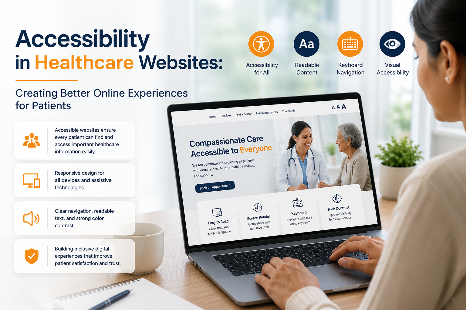
A healthcare website should be easy to use for as many people as possible.
Patients may access a website using a desktop computer, smartphone, tablet, keyboard, screen reader, voice input, magnification software, or other assistive technologies. Some users may have visual, hearing, mobility, speech, cognitive, or learning disabilities. Others may simply be dealing with temporary limitations, an unfamiliar device, poor lighting, or a slow connection.
This makes website accessibility an important part of healthcare web development.
Accessibility is not only about adding technical features for people with disabilities. It is about removing unnecessary barriers so visitors can find information, understand content, navigate pages, complete forms, and take important actions more independently.
The Web Content Accessibility Guidelines (WCAG) 2.2 are a W3C Recommendation and provide internationally recognised guidance for making web content more accessible. They cover a broad range of needs, including vision, hearing, mobility, speech, cognitive and learning-related accessibility.
For healthcare organisations, accessibility should be considered from the planning and design stages rather than added as a final technical check.
What Is Website Accessibility?
Website accessibility means designing and developing digital content so people with different abilities can perceive, understand, navigate, and interact with it.
Accessible healthcare websites should allow visitors to:
- Find important information
- Navigate between pages
- Understand content
- Use forms
- Select options
- Read headings
- Operate buttons
- Access multimedia
- Complete important tasks
- Use assistive technologies where required
W3C groups accessibility principles around four broad areas: perceivable, operable, understandable, and robust.
These principles provide a useful foundation for healthcare website planning.
Why Accessibility Matters for Healthcare Websites
Healthcare websites often contain information that visitors need to access quickly and independently.
A patient may be looking for:
- A doctor
- A healthcare service
- Clinic timings
- Hospital location
- Appointment information
- Contact details
- Patient instructions
- Diagnostic services
- Insurance information
- Educational resources
If a button cannot be reached using a keyboard, a form has unclear labels, or important information is communicated only through colour, some users may struggle to complete the task.
For a healthcare organisation, accessibility is therefore closely connected to patient experience.
An accessible website can make everyday digital interactions clearer and more predictable for a wider range of users.
Accessibility Is Not Only for People With Disabilities
Accessibility improvements can benefit many users.
For example:
Clear headings help screen-reader users navigate a page, but they also help everyone scan long healthcare articles.
Simple forms can support people with cognitive disabilities, while also making appointment enquiries easier for busy users.
Good colour contrast supports people with low vision and can make text easier to read in bright environments.
Captions support people who are deaf or hard of hearing and can also help users watching a video without sound.
Keyboard accessibility supports people who cannot use a mouse and can also help power users navigate websites more efficiently.
W3C notes that following accessibility guidance will often improve usability for users generally, not only people with disabilities.
The Four Core Accessibility Principles
WCAG is organised around four principles.
1. Perceivable
Information should be presented in ways users can perceive.
This can include:
- Text alternatives for images
- Captions for relevant videos
- Sufficient colour contrast
- Content that works with assistive technologies
- Information that does not depend on colour alone
2. Operable
Users should be able to operate the website’s controls and navigation.
This includes:
- Keyboard access
- Clear focus indicators
- Usable buttons
- Accessible menus
- Enough time for relevant interactions
- Avoiding problematic motion or flashing content
3. Understandable
Content and interactions should be clear and predictable.
This includes:
- Readable language
- Consistent navigation
- Clear labels
- Helpful instructions
- Understandable error messages
- Predictable interface behaviour
4. Robust
The website should work reliably with different browsers, technologies, and assistive tools.
These principles provide a useful framework for thinking about accessibility throughout healthcare web development.
Use Clear and Meaningful Headings
Healthcare websites can contain long and detailed information.
A service page may explain:
- What the service is
- Who provides it
- Available facilities
- Locations
- Appointment information
- FAQs
Logical headings make this information easier to navigate.
A page might use:
H1: Cardiology Services
H2: Cardiology Services Offered
H2: Our Cardiologists
H2: Locations
H2: Frequently Asked Questions
Headings should reflect the actual organisation of the content rather than being added only for visual styling.
W3C explains that headings communicate page organisation and can help browsers and assistive technologies provide in-page navigation.
Write Healthcare Content in Plain Language
Medical information can easily become difficult to understand because of specialised terminology.
Accessibility-friendly healthcare content should aim for clear, direct language.
Instead of filling a page with technical terminology, explain important concepts in a way that ordinary visitors can understand.
For example, a healthcare page can introduce a medical term and then explain it in simpler language.
Useful techniques include:
- Short paragraphs
- Descriptive headings
- Bullet points
- Clear sentences
- Explanations of specialised terms
- Direct answers to common questions
- Clear next steps
Plain language does not mean removing medically accurate information. It means presenting it in a way that more people can understand.
Make Images Accessible
Images can provide useful information, but not every visitor can see them.
Alternative text helps communicate the purpose or meaning of relevant images to users who rely on screen readers.
For example, a doctor profile image may need meaningful alternative text, while a purely decorative image may not need the same treatment.
Healthcare websites should consider alternative text for:
- Doctor photographs
- Facility images
- Diagrams
- Informational graphics
- Icons with meaning
- Charts
- Illustrations
The description should communicate the relevant purpose rather than simply repeating a filename.
W3C recommends including alternative text for images as part of basic accessible development practices.
Do Not Use Colour as the Only Information
Colour is often used in healthcare interfaces.
For example:
- Green for success
- Red for errors
- Blue for links
- Different colours for appointment categories
But colour should not be the only way information is communicated.
A form error should include a text message rather than simply turning the field border red.
Similarly, important statuses should have clear text or other indicators.
W3C’s accessibility design guidance specifically recommends not relying on colour alone to communicate information.
Maintain Good Colour Contrast
Text should be sufficiently distinguishable from its background.
Problems can occur when:
- Light grey text is placed on white
- Text is displayed over busy images
- Buttons have low-contrast labels
- Placeholder text is too faint
- Links are difficult to distinguish
Contrast should be considered across:
- Body text
- Headings
- Buttons
- Forms
- Navigation
- Icons
- Error messages
- Focus indicators
W3C includes sufficient contrast among its core accessibility design considerations.
Make Healthcare Websites Keyboard Accessible
Not every user operates a website with a mouse.
Some people rely on:
- Keyboard navigation
- Switch devices
- Alternative keyboards
- Voice input
A user should be able to navigate important website functionality using a keyboard.
This includes:
- Menus
- Links
- Buttons
- Forms
- Search
- Appointment interfaces
- Dialogues
- Interactive controls
W3C’s accessibility principles state that functionality available through a mouse should also be accessible through keyboard interaction, with appropriate focus behaviour.
A practical test is simple:
Unplug the mouse and try to use the healthcare website.
Can you reach the main menu?
Can you open a service page?
Can you complete the enquiry form?
Can you submit it?
If not, accessibility improvements may be required.
Use Visible Focus Indicators
When someone navigates using a keyboard, they need to know where they currently are on the page.
A visible focus indicator can show which link, button, or form field is currently selected.
Removing default focus outlines without providing a clear alternative can make keyboard navigation confusing.
Healthcare websites should therefore make focus states visible and understandable.
Make Forms Easy to Complete
Forms are especially important for healthcare websites because they may be used for:
- Appointment requests
- Contact enquiries
- Callback requests
- Newsletter subscriptions
- Patient registration
- Support requests
Forms should have clear labels and instructions.
For example:
Full Name
Phone Number
Email Address
Preferred Appointment Date
Message
Users should not have to guess what information belongs in each field.
W3C’s Forms Tutorial recommends associating labels with form controls, providing instructions, grouping related controls where appropriate, and avoiding unnecessary data collection.
Keep Healthcare Forms Short
A long form can create unnecessary friction.
If a clinic only needs a visitor’s name, phone number, preferred doctor, and appointment preference to initiate contact, asking for numerous unrelated details may not be necessary.
W3C notes that users generally prefer simple and short forms and are more likely to abandon forms when irrelevant or excessive information is requested.
For healthcare businesses, this also has an important privacy consideration:
Only collect information that is genuinely required for the intended process.
Sensitive health information should not be requested simply because a website form allows it.
Provide Clear Error Messages
A form should not simply say:
“Invalid input.”
A better message explains what needs to be corrected.
For example:
“Please enter a valid phone number.”
Or:
“Please select your preferred appointment date.”
Error messages should be easy to locate and understand.
Users should also be able to correct the problem without having to start the form again.
Accessible error handling benefits users who rely on assistive technologies as well as users who may simply make an ordinary mistake.
Make Buttons and Links Understandable
Buttons should clearly communicate their action.
Instead of using vague labels such as:
Click Here
healthcare websites can use:
- Book an Appointment
- Contact the Clinic
- View Doctor Profile
- Find a Location
- Call the Hospital
- View Services
Descriptive labels make actions easier to understand.
They also provide more useful context when users navigate through links or controls using assistive technologies.
Make Navigation Consistent
Patients should not have to learn a new navigation system on every page.
Important navigation elements should remain predictable.
For example:
- Logo links to the homepage
- Main navigation remains consistent
- Contact information is easy to find
- Appointment CTA remains identifiable
- Breadcrumbs are used where helpful
- Search works consistently
W3C recommends clear and consistent navigation as part of accessible interface design.
Design for Screen Readers
Screen readers convert digital content into speech or other output for users who cannot see or easily read the screen.
Healthcare websites should therefore use meaningful structure.
This includes:
- Correct heading hierarchy
- Descriptive link text
- Form labels
- Alternative text
- Semantic HTML
- Meaningful button names
- Logical reading order
A visually attractive website can still be difficult for screen-reader users if the underlying HTML structure is poorly implemented.
W3C’s page-structure guidance explains that well-structured content can help screen-reader users navigate directly to important sections and can also support keyboard users.
Support Accessible Multimedia
Healthcare websites increasingly use:
- Doctor interviews
- Educational videos
- Facility tours
- Explainer animations
- Webinars
Multimedia should be made accessible wherever relevant.
This can include:
- Captions
- Transcripts
- Audio descriptions where appropriate
- Accessible video controls
A video should not be the only way users can access important information.
If a healthcare organisation explains an important service entirely through a video, a text alternative can make that information available to a wider audience.
Consider Mobile Accessibility
Accessibility is not limited to desktop websites.
People may access healthcare websites through smartphones and tablets using:
- Touch
- Keyboard
- Voice input
- Screen readers
- Magnification
- Other input methods
W3C states that existing accessibility standards such as WCAG cover mobile accessibility, including websites and applications used on phones and tablets.
Mobile accessibility should therefore consider:
- Touch target size
- Readable text
- Responsive layouts
- Clear buttons
- Accessible menus
- Form usability
- Zoom and text scaling
- Orientation
- Screen-reader behaviour
Avoid Overly Aggressive Pop-Ups
Pop-ups can be useful for certain purposes, but they can also create accessibility problems.
Examples include:
- Full-screen appointment pop-ups
- Newsletter prompts
- Chat windows
- Cookie banners
- Promotional overlays
If an overlay appears, users should be able to identify it, understand what it is asking, and close it using appropriate controls.
Keyboard users should not become trapped inside a modal window.
Healthcare websites should especially avoid creating barriers around important information such as contact details and appointment options.
Make Interactive Elements Predictable
Interactive elements should behave in ways users expect.
A button should behave like a button.
A link should take the user to another destination.
A form control should have a clear purpose.
A dropdown should be understandable and usable.
Custom-designed interactions should not sacrifice accessibility simply for visual originality.
If a healthcare website uses custom components, developers should test how those components behave with keyboard navigation and assistive technologies.
Consider People With Cognitive and Learning Disabilities
Accessibility is broader than visual and physical access.
Some users may find complex interfaces, long blocks of text, unpredictable behaviour, or complicated forms difficult to use.
Healthcare websites can reduce unnecessary cognitive load by using:
- Clear headings
- Short sections
- Familiar navigation
- Consistent layouts
- Plain language
- Helpful instructions
- Clear error messages
- Predictable interactions
- Visible next steps
This can make the website easier to use for many visitors.
Accessibility and Search-Friendly Structure
Accessibility and SEO are not the same thing, but some good development practices can support both.
For example:
- Logical headings help users navigate content.
- Descriptive links provide context.
- Meaningful page structure helps accessibility and search understanding.
- Good alternative text supports image accessibility.
- Clear content improves usability.
- Semantic HTML provides meaningful structure.
This does not mean accessibility should be implemented simply for SEO.
The primary purpose is to make the website usable by people with different needs.
SEO can benefit as a natural result of building a clear, well-structured website.
Accessibility and Healthcare Content
Accessibility should also influence how content is written.
A healthcare page should make important information easy to locate.
Instead of creating one extremely long block of text, content can be organised into sections such as:
- What the service is
- Who it may be relevant to
- Available services
- Doctors
- Locations
- Appointment information
- Frequently asked questions
This structure helps visitors scan the page and find what they need.
W3C recommends using headings and meaningful content structure to improve navigation and orientation.
Accessibility and Patient Trust
Accessibility can also contribute to how a healthcare organisation presents itself online.
When a website is clear, predictable, and usable, it demonstrates attention to the needs of different visitors.
On the other hand, inaccessible interfaces can create frustration.
For a healthcare organisation, the digital experience is part of the overall patient journey.
Accessibility should therefore be treated as a quality consideration rather than simply a compliance checkbox.
Common Accessibility Problems in Healthcare Websites
Missing Image Descriptions
Important images may have no meaningful alternative text.
Unclear Forms
Fields may have no visible or programmatically associated labels.
Low Contrast
Text may be difficult to distinguish from its background.
Keyboard Traps
Users may enter an interactive component but be unable to navigate out of it using the keyboard.
Poor Heading Structure
Pages may use headings only for visual styling rather than meaningful content hierarchy.
Vague Link Text
Links such as “Read More” may provide little context when viewed independently.
Inaccessible Pop-Ups
Modal windows may not receive or return keyboard focus correctly.
Colour-Only Indicators
Errors or status information may be communicated only through colour.
Small Touch Controls
Important buttons may be difficult to activate on mobile devices.
Unclear Error Messages
Forms may identify an error without explaining how to correct it.
Autoplay Media
Videos or animations may begin unexpectedly and interfere with navigation or concentration.
How to Make a Healthcare Website More Accessible
Accessibility works best when integrated into the complete development process.
Start During Planning
Identify accessibility requirements before design and development begin.
Design Accessible Interfaces
Consider:
- Contrast
- Typography
- Spacing
- Focus states
- Navigation
- Forms
- Responsive layouts
W3C’s design guidance specifically recommends sufficient contrast, identifiable interactive elements, clear navigation, associated form labels, and designs that work across different viewport sizes.
Develop With Semantic Structure
Use appropriate HTML elements and meaningful structure rather than relying entirely on visual styling.
Test Keyboard Navigation
Complete important tasks without using a mouse.
Test Forms
Check labels, instructions, errors, focus order, and successful submission.
Test With Assistive Technologies
Where possible, test important journeys with screen readers and other relevant tools.
Test Mobile Accessibility
Check different screen sizes, touch interactions, text scaling, and mobile assistive technologies.
Review Content
Check headings, language, alternative text, captions, link labels, and instructions.
Monitor After Launch
Accessibility should not end when the website goes live.
New pages, plugins, components, campaigns, and redesigns can introduce new accessibility problems.
How World SEO Services Can Support Accessible Healthcare Websites
Accessibility should be considered alongside website structure, SEO, performance, content, and conversion requirements.
World SEO Services can support healthcare businesses with website development and optimisation that considers accessibility as part of the wider digital experience.
Depending on the project, this can include:
- Accessible website structure
- Responsive healthcare web development
- Semantic page structure
- Accessible forms
- Mobile-friendly interfaces
- Healthcare content organisation
- Technical SEO
- Performance optimisation
- Conversion-focused website improvements
- Accessibility checks
- Ongoing website maintenance
The exact accessibility requirements should be assessed according to the website, its users, technology stack, applicable standards, and organisational needs.
A Practical Healthcare Website Accessibility Checklist
Before launching or redesigning a healthcare website, review:
Content
- Are important images given appropriate text alternatives?
- Are headings logically organised?
- Is healthcare terminology explained clearly?
- Are links descriptive?
- Are videos captioned where appropriate?
Navigation
- Can the website be used with a keyboard?
- Is keyboard focus visible?
- Is navigation consistent?
- Can users easily identify where they are?
Forms
- Does every important field have a clear label?
- Are required fields identified?
- Are instructions understandable?
- Are error messages useful?
- Can users correct errors easily?
Visual Design
- Is text sufficiently distinguishable from the background?
- Is colour avoided as the only indicator?
- Are interactive elements easy to identify?
- Does the layout remain usable when text is enlarged?
Mobile
- Are controls easy to activate?
- Does content remain readable?
- Can users navigate menus and forms?
- Does the website work with mobile assistive technologies?
Technical
- Is the HTML structure meaningful?
- Do interactive elements work with keyboards?
- Are custom components accessible?
- Are third-party tools introducing accessibility barriers?
Testing
- Has keyboard testing been completed?
- Have important forms been tested?
- Has mobile accessibility been reviewed?
- Has assistive-technology testing been considered?
- Are accessibility issues monitored after launch?
Why Accessibility Should Be an Ongoing Process
A healthcare website is rarely static.
New doctors may be added. New services may launch. Content changes. New booking systems are integrated. Website designs evolve. Marketing teams publish landing pages.
Every change can potentially introduce an accessibility issue.
That is why accessibility should be part of:
Planning → Design → Development → Content → Testing → Launch → Maintenance
rather than a single audit performed just before launch.
WCAG 2.2 provides the current W3C Recommendation framework, while W3C continues to provide additional guidance for applying accessibility principles to different technologies and contexts.
Final Thoughts
Accessibility in healthcare websites is ultimately about making digital healthcare information and services easier to access for people with different abilities and different ways of interacting with technology.
A genuinely accessible website does more than pass a technical checklist.
It helps visitors understand content, navigate confidently, use forms, operate interactive elements, access multimedia, and complete important tasks.
For healthcare organisations, these details matter because the website may be the first digital interaction a patient has with the provider.
Accessible headings, readable content, meaningful images, clear forms, keyboard navigation, sufficient contrast, mobile usability, predictable interactions, and thoughtful testing all contribute to a better online experience.
Accessibility should therefore be built into healthcare web development from the beginning rather than treated as an optional feature added later.
When accessibility is combined with strong technical development, useful healthcare content, mobile-friendly design, performance optimisation, and SEO, a healthcare website can become more usable, inclusive, and sustainable.
World SEO Services can help healthcare businesses approach website development as a complete digital experience, where accessibility, search visibility, technical quality, and patient usability work together.
FAQs
1. What is accessibility in healthcare website development?
Accessibility in healthcare website development means creating websites that people with different abilities can perceive, navigate, understand, and interact with. It can include keyboard accessibility, screen-reader compatibility, readable content, accessible forms, sufficient contrast, alternative text, captions, and mobile accessibility.
2. What accessibility standard should healthcare websites follow?
WCAG 2.2 is the current W3C Recommendation for web accessibility. It provides guidelines and success criteria covering areas such as perceivability, operability, understandability, and robustness. The appropriate conformance requirements can depend on the organisation, users, jurisdiction, and applicable regulations.
3. Why are accessible forms important on healthcare websites?
Healthcare websites often use forms for appointments, enquiries, registrations, and other interactions. Clear labels, instructions, appropriate grouping, and useful error messages can make these forms easier to complete for people using screen readers, keyboards, voice input, or other assistive technologies.
4. Does website accessibility help all healthcare website visitors?
Yes. Although accessibility specifically addresses barriers faced by people with disabilities, many accessibility practices can improve usability for everyone. Clear headings, simple forms, readable content, captions, predictable navigation, and understandable instructions can benefit a broad range of users.
5. How can a healthcare website be tested for accessibility?
Testing can include automated accessibility checks, keyboard testing, manual review, mobile testing, form testing, code and semantic-structure checks, and testing with relevant assistive technologies such as screen readers. Accessibility should also be reviewed whenever new content, features, integrations, or design changes are introduced